Desirable
Make every miniature feel like a discovery. Let material, skin and texture do the talking.
OUR BRAND / DIRECTION 01
Meet The Beauty Edit. Bright, tactile, curious. A beauty discovery brand with a point of view.
See it in application ↗Find your next
obsession.
Our role is to make the first try feel worth it.
Your introduction to
something you’ll love.
Dew Pocket is a beauty discovery editor. We bring a thoughtful selection into reach, so people can explore a texture, try a routine, and form their own opinion.
Five samples. One small introduction. A one-time pack, with clear contents and room for honest first impressions.
Make every miniature feel like a discovery. Let material, skin and texture do the talking.
A clear offer and an easy invitation. Speak like the friend whose beauty taste you trust.
Explain the selection. Be specific about products, expectations and the choices people make.
A confident lowercase wordmark and typography that gives the image room.
Aa. A little
more feeling.
Bold display. Regular body. Tight headlines, easy reading.
Keep a clear space of one lowercase “i” around the wordmark. Use solid ink or white. The blue full stop is an optional accent. Never stretch the mark.
Paper leads. Ink gives structure. Blue marks the moment.
Select a swatch to copy its hex value.
Approximate graphic balance, excluding photography. Use Action blue for white button labels; reserve Azure for accents or dark text. Skin tones and real packaging bring natural color.
Invite exploration. Leave room for personal preference.
Short and concrete. Make the small format feel intentional.
First impressions matter. Avoid perfection promises, invented popularity and pressure.
Crisp daylight, actual texture, and beauty at human scale.
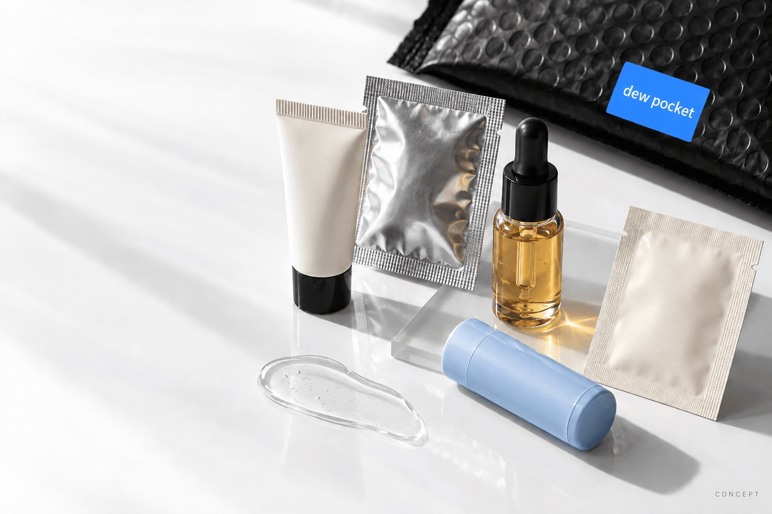
Show material: foil, cream, glass, gel. Use hands and natural skin in future campaign imagery.
White surfaces, black details, one blue accent. The black mailer supports the assortment.
Partner packaging can vary. Use real sample sizes and actual contents when the pilot is ready.
Generated concept photography. Products, packaging and contents are illustrative; no participating brands or stock are implied. Production foam material still needs validation.
A focused creative scan, September 14, 2026. Observations from current brand sites; these are visual references, not a sales ranking.
Neutral framing, oversized campaigns and collectible minis. Make a sample an object you want to reach for.
Sunlit skin, colorful formulas and blue alongside warm cream. Photography makes a cool palette feel human.
White space, black type, slate blue and tactile materials. A useful reference for editorial restraint.
Black packaging on a pale canvas, large crops and visible formulas. Contrast can be crisp and sensorial.
A simple commerce frame hosts a specific New York campaign. Context and personality give products a life.
An enormous wordmark, glossy skin and direct human presence. Confidence comes from scale and point of view.
IPSY already owns a recognizable monthly discovery-and-quiz proposition. Our proposed distinction: a considered one-time introduction, an approachable commitment, and useful first impressions. Selection quality has to earn that promise.
For market context, YipitData’s May 2026 research also finds strong clinical K-beauty and marketplace momentum. This aesthetic is a creative choice, not a claim that white sites cause growth.
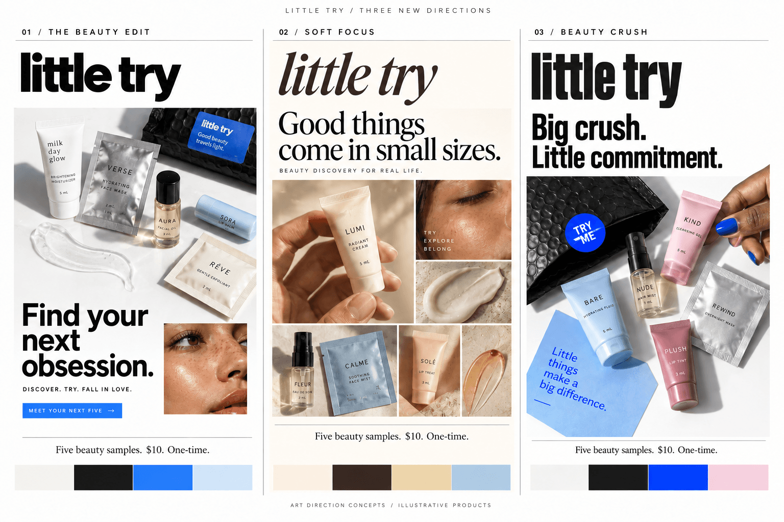
Direction 01 selected. Generated product labels and incidental copy are illustrative; this guide defines the working identity.
FROM IDENTITY TO INTERFACE